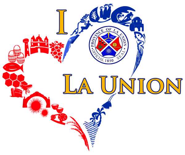
‘I LOVE LA UNION LOGO’
ORDINANCE OF 2020
PROVINCIAL ORDINANCE NO. 283, SERIES OF 2021
By virtue of La Union Ordinance No. 283-2021, the “I Love La Union” logo was adopted as the official logo of the province.
The I Love La Union logo is the trademark of the Provincial Government of La Union registered under Intellectual Property Office Philippines.
The logo may be reproduced by any means or in any form without written permission and should be used only in authorized official purposes.
I LOVE LA UNION LOGO
In 2016, heartbreaking moments brought about by the devastation of Typhoon Yolanda in the Eastern and Central Visayas inspired then-Congressman Francisco Emmanuel “Pacoy” Ortega III together with the former Governor, Manuel C. Ortega, to formulate the “La Union Cares” campaign which called for united effort in extending help to the victims and survivors of the calamity. A logo was created to symbolize the La Union Cares campaign which featured the Official Seal of the Provincial Government, a blue and red-colored heart symbol, and hand-holding people. These represent the remarkable stories of heroism and perseverance of kindness and hope of love and sharing which transformed the lives of many.
Today, the Province embarks on another historic journey. Drawing inspiration from the “La Union Cares” campaign, the Provincial Governor, Francisco Emmanuel R. Ortega III, aims to make difference in the lives of the people of La Union. His hope is to bring real change to the Province driven by expansive participation of all stakeholders while drawing strength from the Province’s natural resources endowment. He saw that the abundant riches of the rural expanse and beauty of the La Union countryside were woefully had immensely untapped potential. Nineteen (19) Municipalities and one (1) City, each with unique products and tourist attractions, could be transformed to become a grand showcase. This realization and his dream of a greater province would inspire his vision for La Union to become the Heart of Agri-Tourism in Northern Luzon.
The original La Union Cares Logo was enhanced to capture the new thrust of the Province. The “I love La Union” heart emblem symbolizes the union of the different Municipalities and sole City and the aspiration to bring each of their different Agri-Tourism products and destinations together under a unified provincial vision. The Grapes of Bauang, the church representing the Our Lady of Namacpacan of Luna, Saints Peter and Paul Parish in Bauang, St. William Cathedral in City of San Fernando, and Basilica Minore of Our Lady of Charity in Agoo, Poro Point lighthouse of the City of San Fernando, bamboo baskets of Sudipen, Dried-fish (daing) of Santo Tomas, honey production of Bacnotan, Baluarte of Luna, welcome arc of Rosario, sea urchin (maritang-tang) of Balaoan, pottery of San Juan, traditional woven cloth (inabel) of Bangar, bamboo products of Caba, Beach Capital of the North – Bauang, walis-tambo of Santol, San Gabriel, Burgos, and Bagulin, rice-products of Agoo, Bangus industry of Aringay, Thunderbird of the City of San Fernando, Surfing Capital of the North – San Juan, Basi of Naguilian, native tobacco of Tubao, pebble stones of Luna, Pugad Adventure of Pugo, and Tangadan Falls of San Gabriel, among others, comprise the ‘heart’ of the logo, The blue and red colors of the heart symbolize responsible and reliable governance and the love and passion to serve. Each separate symbol is connected to form the whole heart which represents unwavering support and love for La Union and its quest for true change and transformative governance and the rallying cry of its people: “I love La Union, Everything I do is for the Love of La Union and for God’s greater glory.”
